
Corrgram: Multi-variate visualization

Corrgrams, invented and coined by Michael Friendly in his 2002 American Statistician paper are a powerful and rapid way to visualize a dozen or more dimensions simultaneously when in the exploratory phase of multi-variate analysis. (Note that Corrgrams are sometimes erroneously referred to as Correlograms, which are something completely different for time series analysis.)
The visualization below is an example generated by the R package corrgram on the Lending Club peer-to-peer lending data that was part of the homework assignment for the Coursera class I took a year ago, Data Analysis.
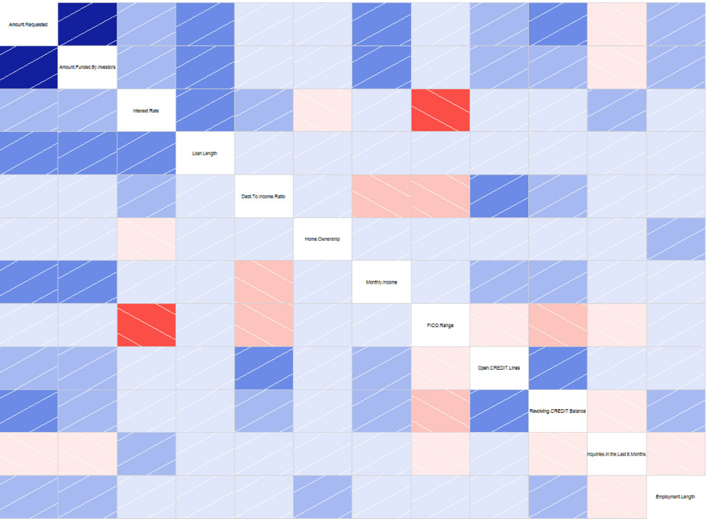
In the visualization above, brightness (more properly, saturation) of red indicates negative correlation and brightness (saturation) of blue indicates positive correlation, meaning weakly correlated dimensions appear grayish.
The bright red box that jumps out is that FICO score is strongly negatively correlated to interest rates. This highlights two unsurprising points: 1) The higher the FICO score, the lower the interest rate, and 2) FICO score has the strongest influence (by eyeball comparison to all the faded blue squares) on interest rate. We also see that things like loan length, debt-to-income ratio and number of open credit lines increase interest rate, with loan length being the strongest of those secondary influences.
But there's more we can pull out of this visualization. Notice that number of inquiries in the last six months (which means the number of inquiries on one's credit report with the FICO scoring agencies coming from all loan or credit applications, not just those from Lending Club) is a strong influence on Lending Club interest rate. But the correlation between number of inquiries in the last six months and FICO, while a negative correlation as expected, is only a weak negatively correlation from its very pale rose color. That suggests that perhaps Lending Club lenders more strongly dislike (and thus penalize) borrowers with a lot of credit inquiries than do conventional lenders. It suggests perhaps that Lending Club lenders dislike (disproportionately so relative to conventional lenders, or at least the FICO scoring system itself) being the "lender of last resort" and assign a higher risk and thus higher interest rate to such situations. This quilt of colors can't tell us all this for certain -- neither numerically in statistics nor certainly in terms of causality -- but it quickly points us onto paths of investigation that could lead to verifying such unanticipated insights.
Now, the 12 dimensions in the above visualization push the envelope of what is practical with corrgrams, whereas data sets in real life often have hundreds of dimensions. In multi-variate analysis, one way to reduce the number of dimensions is to perform a random forest followed by a variable importance plot. While random forest has a reputation of being opaque, one can still easily obtain the list of variables chosen as top nodes most often. From that list, simply pick the first dozen or so and plug them into a corrgram to visualize the interactions amongst the most important deciding variables. This can be improved further through iteration: if two variables, such as, hypothetically, "Average bank balance for past 3 months" and "Average bank balance for past 6 months" are shown to be strongly correlated, you can discard one of those in the corrgram and use that valuable corrgram slot for a different variable.