Top 5 Graph Visualisation Tools
Data visualisation is the process of displaying data in visual formats such as charts, graphs or maps. This method is commonly used to grasp more meaning out of a snapshot of data which in other approaches might require sorting through piles of spreadsheets and great quantity of reports. With the amount of data growing rapidly it is more important than ever to interpret all of this information correctly and quickly to make well-informed business decisions.
Graph visualisation has a fairly similar approach just with a more diverse and complex sets of data. A graph is a representation of objects (nodes) which some are connected by links. Graph visualisation is the process of displaying this data graphically to maximise readability and allow to gain more insight.
Here is the list of top graph visualisation tools that Data to Value found useful.
Gephi
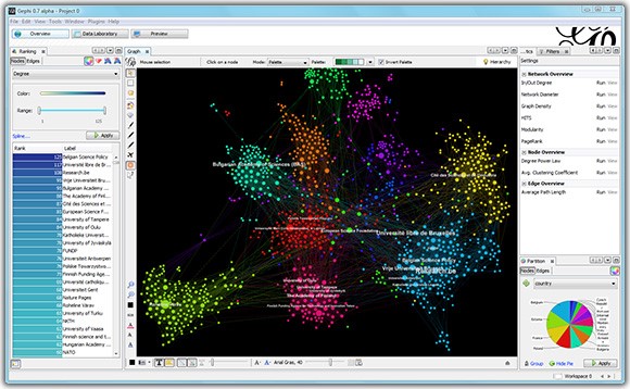
Gephi is an interactive visualization and exploration solution that supports dynamic and hierarchical graphs. Gephi’s powerful OpenGL engine allows for real-time visualisation that supports networks up to 50,000 nodes and 1,000,000 edges. It also provides the user with cutting edge layout algorithms that include force-based algorithms and multi-level algorithms to make the experience that much more efficient. Moreover, the software is completely free to use, the company only charges for private repositories.
Tom Sawyer Perspectives
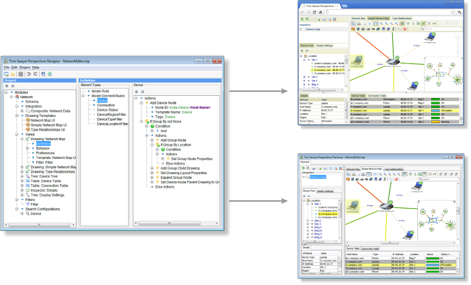
Tom Sawyer Perspectives is a graphics based tool for building data relationship visualization and analysis applications. This software supports two graphic modules: designer and previewer. The designer helps users to define schemas, data sources, rules and searches. The previewer can be used to iteratively view the application design without the need to recompile. Using these two tools together can drastically increase the speed of application development. Other features of Tom Sawyer Perspectives include: data integration for structured semi-structured and unstructured data, multiple view support and advanced graph analytic capabilities.
Keylines
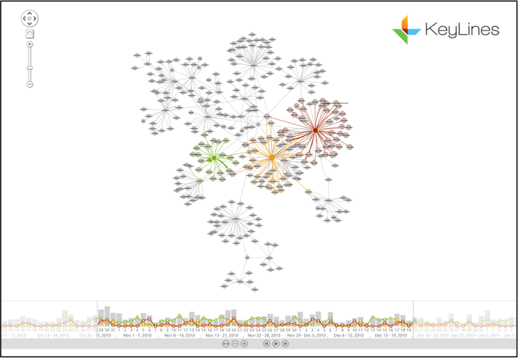
Keylines is a Javascript toolkit that allows to create a custom network visualisation in a quick and easy way. Keylines puts more freedom into the user’s hands as it is not a pre-built application, this enables the developer to change nodes, links, menus and add entire functions with a few lines of code. This solution also includes geospatial integration, time bars, various layout patterns and filtering options.
Linkurious
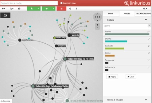
An intuitive graph visualisation solution that offers an easy out-of-the-box set up with no configuration needed. This allows people who are not particularly tech savvy to start analysing and discovering insights in complex data. Linkurious includes a robust search engine helping users find text in edges and nodes. Moreover, it includes advanced analytic capabilities allowing to combine filters to answer complex questions. Linkurious also has the ability to identify complex patterns by using Cypher – a query language designed specifically for graph analytics.
GraphX
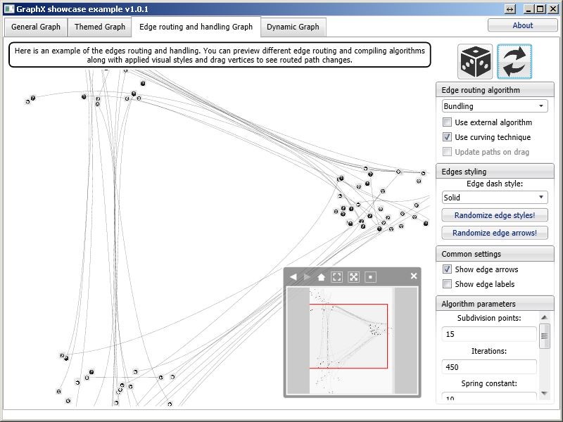
GraphX is an advanced graph visualization software, it is an open-source project and is a part of the Apache Spark engine. As it is open-source there is a lot of room for customisation from special functions to custom animations. It also utilises Spark’s computing technology that allows for the capture and storing of visual and data graphs in-memory. It has built in default support for layout algorithms, advanced graph edges and vertex features. GraphX also includes a visual preview function for all controls as well as rich usability documentation and user support.
About us
Data to Value are a specialist Data consultancy, based in London. We apply graph technology to a variety of data requirements as part of next generation data strategies. Contact us for more details if you are interesting in finding out how we can help your organisation leverage this approach.

